_edited.png)
Safely
Case Study
My Role: UX & UI Designer, Researcher
Timeline: Jan 2024-Feb 2024
Overview
Task: A major project in the XA interaction design course was to create an interactive platform that advances a social impact of our choice. Additionally, this project's purpose was to "design an interface that aims to act as protection, enhancement, or a tool to serve a community, improve social behavior, or overcome challenges in a community."
The intended broad outline for this two-month design project allowed us to think innovatively as students and further develop our design and technical skills that could replicate a similar challenge we would encounter as professionals in the UX industry.
Main Objective: This project aimed to develop an idea that improves a community's environment and creates an application that improves users' lives in various ways.
The project deliverables consisted of collecting research and interview data, synthesizing the data using affinity mapping and competitive analyses, and then generating a user-need statement and interactive task flow. Ultimately, the user data guided our stages of wireframing, which also developed our final design system and prototype.
The Challenge
In the initial brainstorming session, our team had a strong interest in creating an application that would challenge the traditional travel service platform. To learn more about how we could improve our ideas, we conducted interview questions and gathered information from our peers to create an initial task flow and provide core objectives for the app concept.
Process
Step 1: Interviews & Research
A list of interview questions was drafted to help create a more user-centered problem statement and establish the key functions of the application:
-
How often do you travel?
-
When traveling, which parts do you often look forward to?
-
Do you rely on any accommodations while traveling?
-
When traveling, which aspects of the trip do you plan?
-
Have you faced any barriers while traveling in the past?
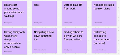
The interview results improved our task flow and overall concentration on the app's objectives. Continuing our research, we used UX methodologies like affinity mapping, a competitive analysis, and constant experimentation on our mid-fi and high-fi wireframes to improve user-task flow.
Step 2: Analyze Interviews & Research
Recommendations from User Interviews:
Focus on Travel Organization
Prioritize planning for transportation, housing, and activities.
Stress-Free Features
Provide reliable recommendations, reviews, and critical information on accessibility plans.
User-Friendly Functionality
Streamline planning and peace of mind, reduce friction often associated with travel.


Affinity Map

Competitive Analysis
User Need Statement
Travelers that belong to marginalized groups need to feel informed about the safety and accommodations of their travel destination so that traveling can be a safe, accessible, and enjoyable experience for everyone.

Problem Statement
1. While traveling, people who belong to marginalized groups face the risk of harassment or discrimination that can put their safety at risk.
2. This makes travel difficult because it is hard to determine what activities and establishments are safe in an unfamiliar area.
3. Being overly cautious of safety can make travel and vacation far less enjoyable and accessible.
Step 3: Sketching & Wireframes
This stage involved drafting our design plan and exploring different ways to incorporate features that we learned users would benefit from in the research phase. Developing a standard, cohesive user-task flow allowed the design sketches and wireframe stages to evolve more holistically.

User Task Flow

Sketches


Lo-fi Wireframes
The first iterations of Safely’s wireframes reflected the initial sketch concepts of the general layout and task flow. The design decisions made in the mid-fi stage were adapted to give users more flexibility and added additional features that enhanced the user’s experience and enjoyment of the app.


Hi-fi Wireframes
Step 4: Design System


The branding scheme development incorporated bright colors and symbolic elements that would engage people using our product. Along with our interactive buttons and hover states, the descriptive symbols further immersed users in enjoying the travel experience, but also the planning process, which typically can be stressful or overwhelming for users.
Step 5: Usability Testing & Revised Prototype
Usability testing was then conducted to uncover potential usability issues, gather further insight into how intuitive the interface is, and improve the overall user experience:
User Tasks for Testing
1. Locate the URL for Tempo Cafe’s website.
2. Find Tempo Cafe’s average star rating.
3. Accept a pending friend request from Manny Fredson.
4. Locate the cafe in Chicago with the highest safety rating.
Test Findings
-Some important features were not intuitive, for example: finding a nearby location with the highest safety rating, the safety rating bar.
-Create a more accessible navigation path to the social tab and add travel buddies.
-Improve the search functionality, specifically, by type of location.
_edited.png)
Emphasized the sort by safety feature.
A new personal profile page to connect with other users.
Users can now connect with travel buddies and view their recent reviews.
Step 6: Final Prototype
Takeaways
In this project, we learned a critical understanding of the multilayer UX process. A major stage that required attention was collecting detailed user research. Throughout various stages of peer review, usability testing, and analyzing similar apps to our prototype, we tested Safely’s features and modified designs to improve the accessibility of the final product.
After evaluation, some future iterations that would be beneficial to improve Safely were to build more elements of our prototype, specifically, frames that emphasize instructions and key features of the app’s functions. For instance, explaining the reasoning for the safety bar and how it will affect the reviews for each location.